Strong Therapeutics Website UI/UX Design
This client wished to keep their name secret, so I provided them with a fictional name to conceal their identity: Strong Therapeutics.
When designing Strong's website, my team and I aimed to solve a simple problem: how to convey our client’s message effectively to the world while also providing complex information for potential collaborators and investors? Through extensive research and analysis, we were able to design a website that is unique in the industry, simple to navigate, and contains easily absorbable complex content.
Note: Due to legal reasons, all copy content has been replaced with “Lorem Ipsum” placeholder text.
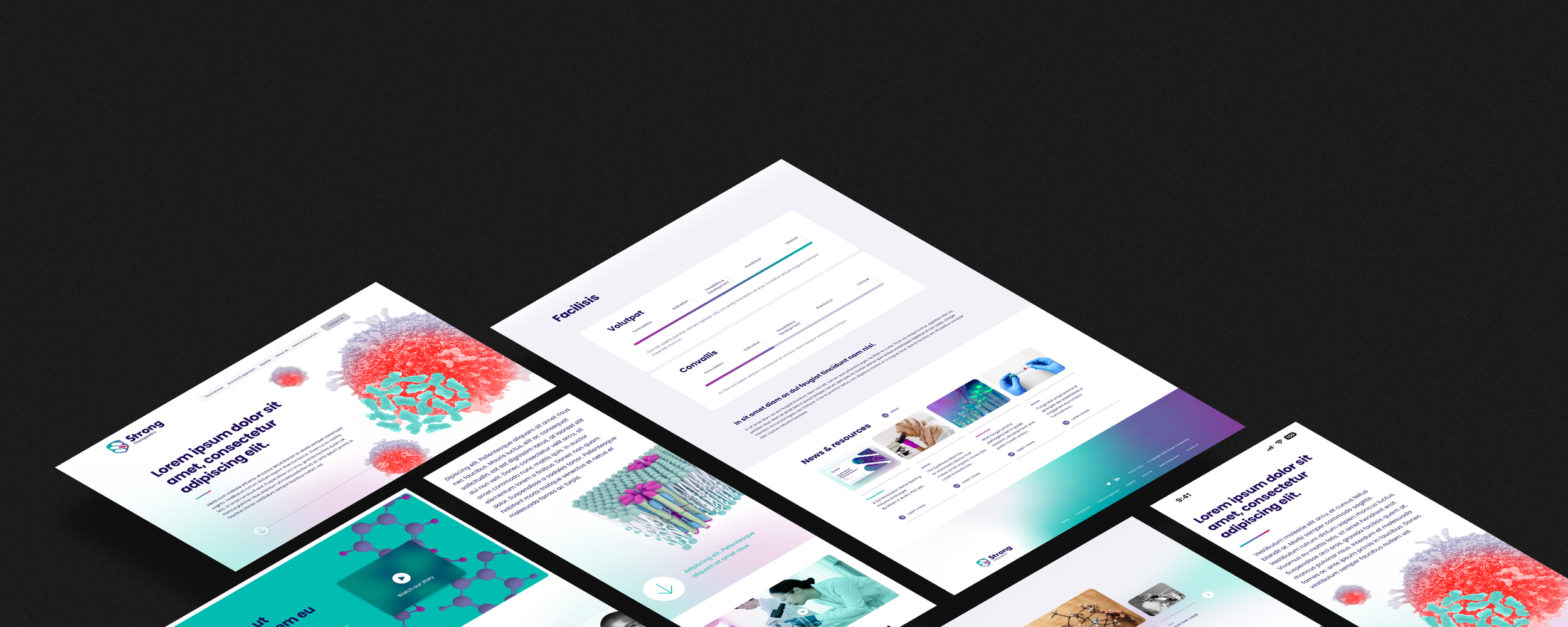
Home Page Flow Desktop mockup
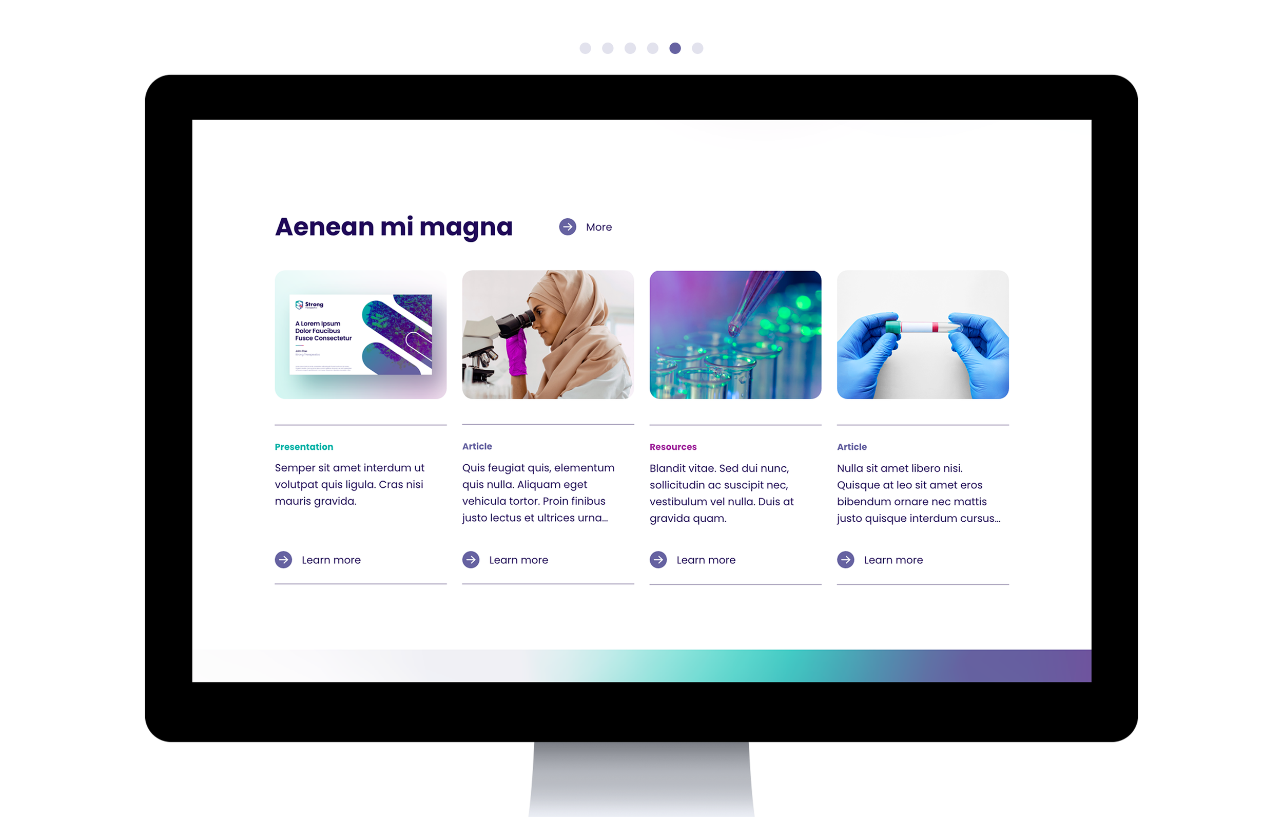
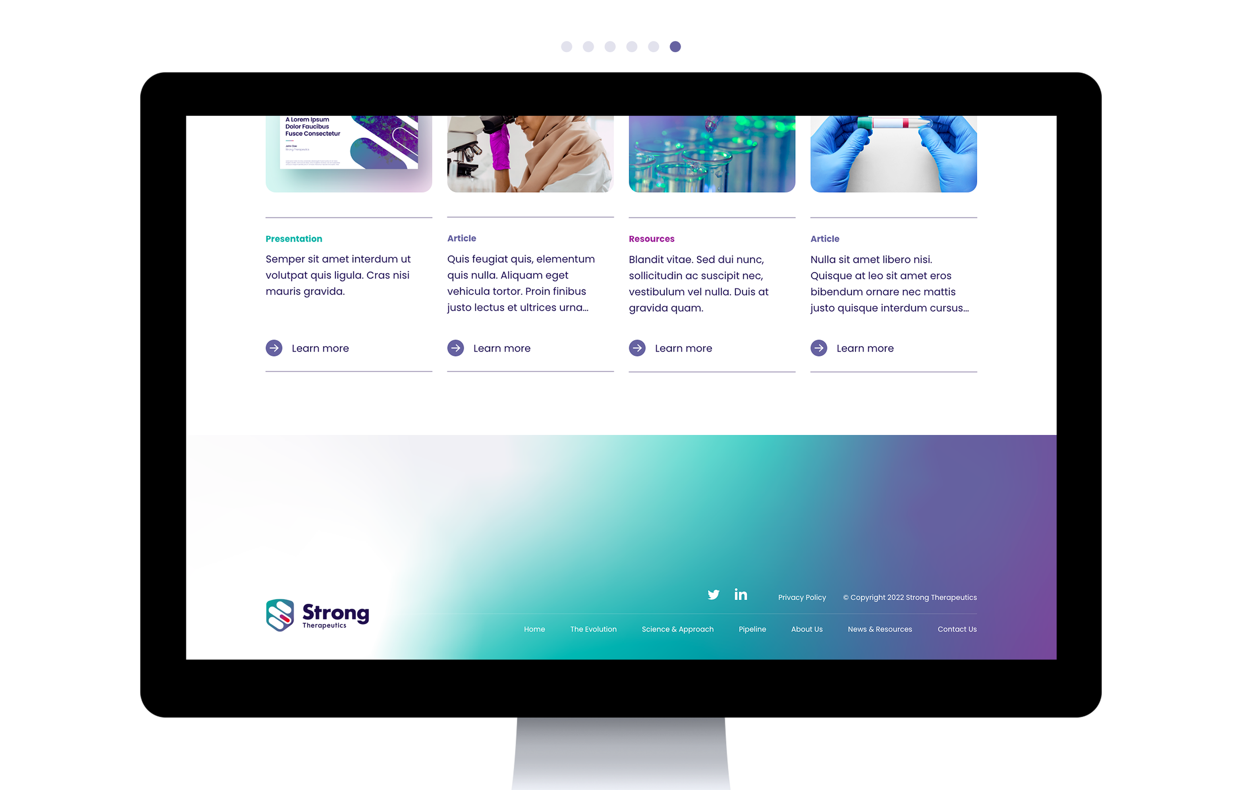
In order to differentiate Strong's website from others in the industry, we implemented several design choices such as ample negative space, visually striking yet minimalist graphics, and parallax/slide-over effects. These design elements move away from the typical aesthetics associated with pharmaceutical companies. As the designer, I was tasked with developing concepts, creating wireframes, and producing mockups. Please refer to the examples below for a visual representation of these design choices.


Site Structure A quick glance of the site map and its simplicity
Mocked up Wireframes Examples of my concepts and prototypes
UI Design An example of the stylesheets and color schemes
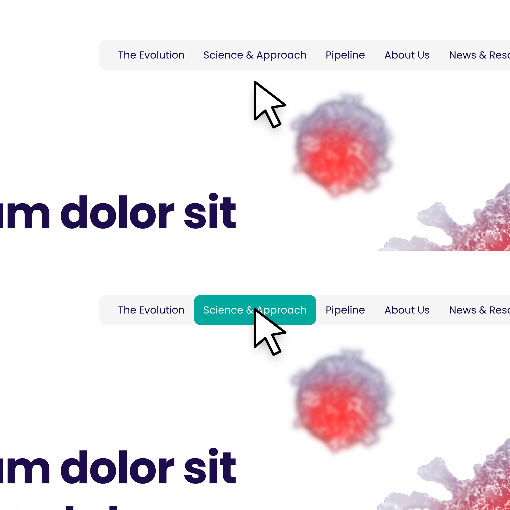
To enhance the user experience and align with the biological theme of the website, I designed every button to exhibit an interactive element. Whether it's a hover-over effect or a clickable feature, each component of the design is meant to feel responsive and dynamic. This not only elevates the user experience but also imbues the website with a sense of liveliness, making it feel like a living entity.
A Closer Look at the UI/UX design


