Blink Home Security App Redesign Concept
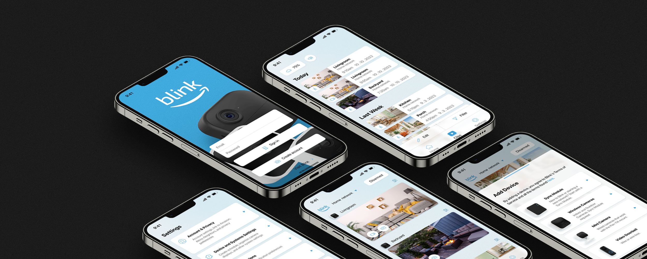
The Blink Home Security app empowers users to manage their Blink devices, review recorded videos, and customize settings, among other functionalities. After years of operation, we recognized the need to update and enrich our customers' experience through a redesign of the app. Regrettably, due to internal challenges, the planned app redesign project did not materialize. Nonetheless, I personally continued the project by revamping the app during my own time, illustrating the envisioned improvements and potential enhancements.
Though functional, the old Blink Home Security app needs modernization for variety of reasons. The Blink app requires a complete aesthetics makeover: colors, buttons, menus, typography, and many other visual elements needs to be updated. From a UX standpoint, the Blink app is workable but there’s plenty of room for improvement and streamlining.
To redesign this app, I started from scratch. Through industry analysis, competitor research, and internal testing, I envisioned an app that would enhance and modernize the UI, design a more efficient and streamlined experience flow, all while retaining the original app’s identity. Below you’ll see my methods and reasoning on how I would redesign the Blink app.
UI/UX Design
Designing the architecture and interaction of the app was key to ensuring users have a seamless and stress-free experience in the new redesign. The sitemap outlined the app's structure and taxonomy, also identifying the primary and secondary pages. The user flow provided a clear picture of how users navigate within the app, ensuring each path is efficient and smooth. Using research data, I identified the four main uses of the app and redesigned it to cater to those purposes.
Sitemap An outline of primary and secondary pages
User Flow A highlight of our user’s journey
Wireframes
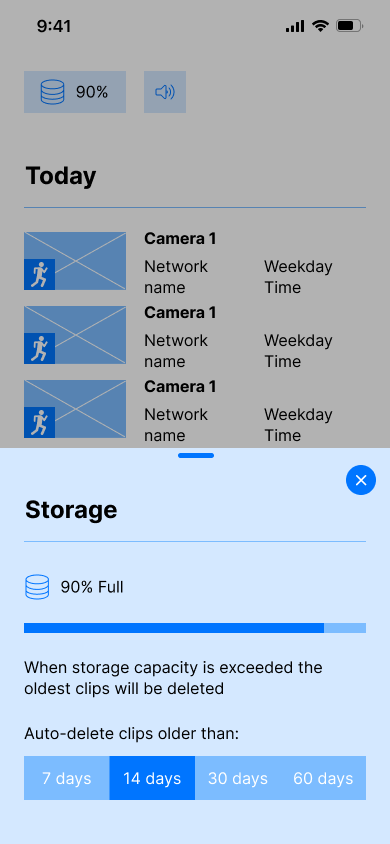
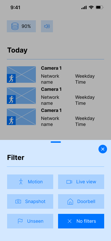
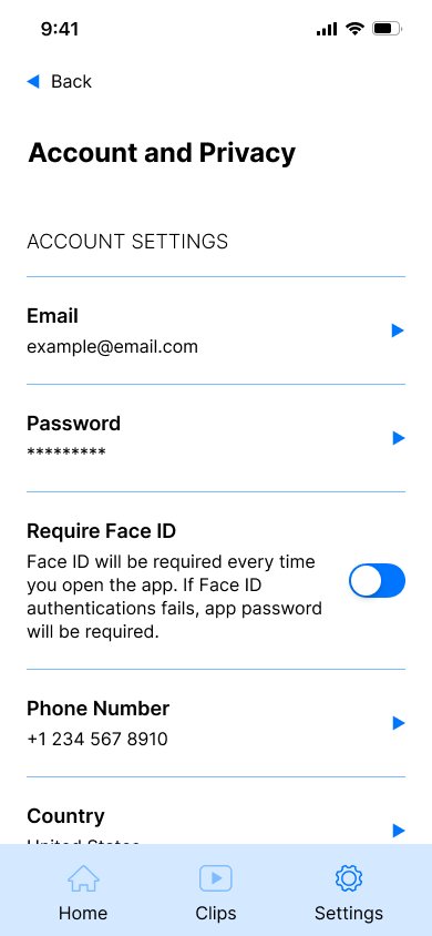
These deliverables acted as the foundational plans for developing low-fidelity wireframes. I employed these wireframes to enhance my designs further through prototyping and usability testing.
Low-Fidelity Testing functionality and usability
Branding
I didn't have to create an entirely new branding for the Blink Home Security app because Blink already possesses a strong existing brand. However, I did make some adjustments to better align the current brand with the app redesign.
Logo A rejuvenation
When I was still working for Blink, one of the things my team and I wanted to do was redesign the Blink logo to make it cleaner and more usable. The main reason for wanting a redesign was that the old version of the logo had too many components attached to it, making it too busy. So, I aimed to remove the “an Amazon company” tagline and the large horizontal bar that resided on top of “Blink.” The challenge was to redesign it in a way that retained its old Blink identity while also reflecting that it’s an Amazon entity.
Years later, after my departure, it seems like the current Blink team did make those changes. I did alter the logo a bit more by replacing the current font with the old font to further cement Blink’s old identity into the new design.
Colors Palette enhanced
Blink’s blue color palette, complemented by simple, rounded sans-serif typography, creates a welcoming and approachable ambiance. I’ve introduced a few new colors to enhance the palette's dynamism, offering a range of hues to complement various UI components.
Typography
Product Design
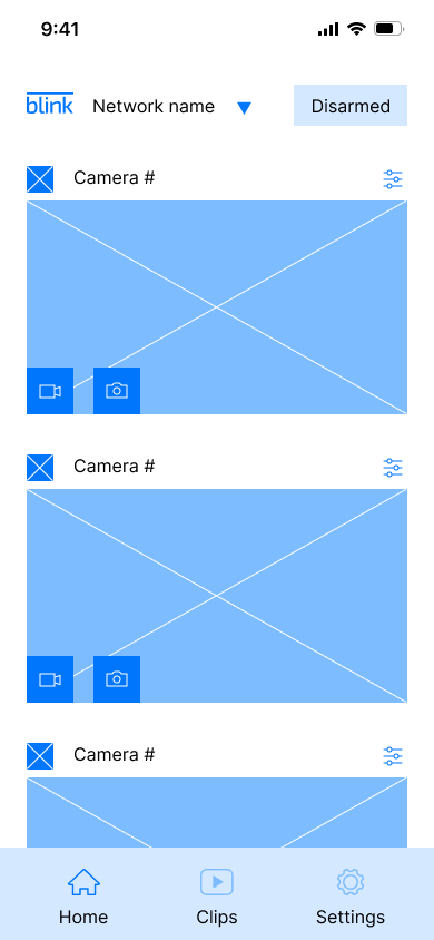
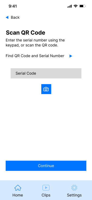
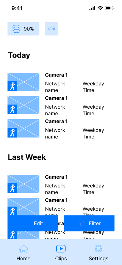
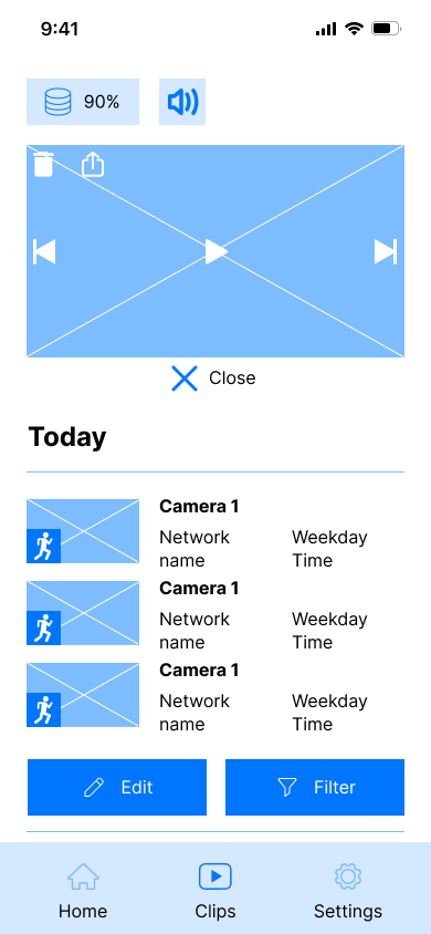
The Blink Home Security App provides users with control over their devices. Users can create new networks, add more devices, live view their cameras, check recorded clips, and adjust settings. Users will be able to accomplish all of that with ease and efficiency.


